By Caroline Chen, graphics by Ash Ngu, ProPublica
It’s the middle of the summer, and the coronavirus has not gone away.
When the pandemic first began, some had hoped that there’d be a lull during the summer, with the heat knocking the virus into submission, but it has continued its march across America, with outbreaks flaring across the southern and southwestern states.
Arguments have also become part of the daily discourse, with people debating over case counts and death tolls, how the trends should be interpreted and whether the reported numbers can even be trusted.
I’ve watched so many reporters, both at ProPublica and at other outlets, do their best to debunk myths, demystify confusing trends and answer the public’s questions. It is, frankly, exhausting, especially when the same arguments keep coming up again and again.
I’m also concerned to see not just laypeople, but local and national leaders, using data out of context to justify their own narratives.
At the same time, I see members of the public who are sincerely confused, trying to find a way through all the numbers and charts being thrown around, asking: “How concerned should I be right now? How bad are things, really?”
So I wanted to step back and, with my colleague Ash Ngu, walk you through some common coronavirus metrics and explain how to interpret them. I hope this will leave you better equipped to assess claims with appropriate skepticism, filter out the garbage and find the real signal amid the noise.
Case Counts Won’t Give You the Full Picture
The first thing I asked experts was: What metric would you recommend I track if I wanted to understand what was going on in my state?
Both Matthew Fox, professor of epidemiology and global health at Boston University, and Youyang Gu, a data scientist best known for his COVID-19 prediction models, advised looking at three measurements together: number of cases, case positivity rates and number of deaths.
“Cases going up or down tells you a fair bit about what’s going on at the moment in terms of transmission of the virus — but it’s only valid if we’re testing enough people,” Fox said.
ProPublica is a Pulitzer Prize-winning investigative newsroom. Sign up for The Big Story newsletter to receive stories like this one in your inbox.
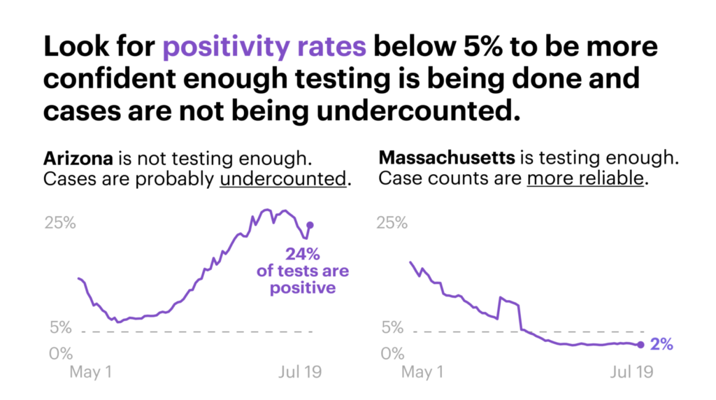
When there aren’t enough tests available, as was the case in New York in March, the number of cases reported will be an undercount, perhaps by a lot. That’s where case positivity rates come in: that measures the percentage of total tests conducted that are coming back positive. It helps you get a sense of how much testing is being done overall in a region.
“WHO guidelines say we want that to be below 5%,” Fox noted. When a positivity rate is higher, epidemiologists start worrying that means only sicker people have access to tests and a city or region is missing mild or asymptomatic cases. When almost all of the tests come back negative, on the other hand, it’s a good indicator that a locality has enough tests available for everyone who wants one, and public health officials have an accurate picture of all the infections, Fox said.
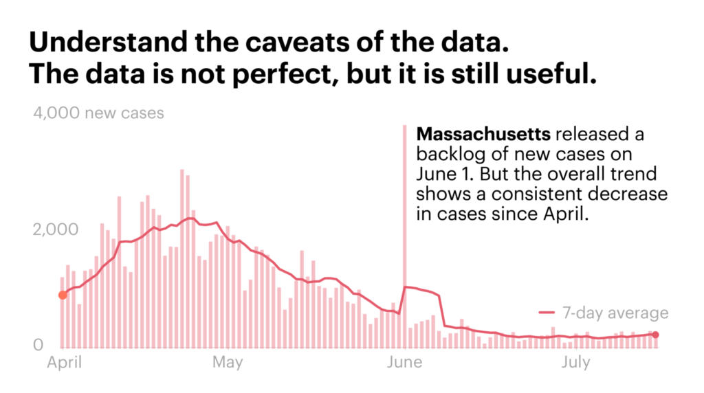
He gave the example of Massachusetts, where he lives. Currently, daily positive case counts have been steadily falling for the past three months. “The positivity rate is now below 2%, so I feel confident in saying that we know what’s going on, and it’s not that we’re not doing enough testing and we’re missing a lot of positive cases.”
On the flip side, any state where the positivity rate is higher than 10% is “really going to worry me,” Fox said. “That tells me that we’re probably missing a fair number of cases, and you’re not doing enough testing to see what’s going on.”
Fox noted that some states in the Sun Belt, such as Arizona and Florida, have recently had very high positivity rates, even above 20%. “That means we don’t have full visibility.”
Deaths are also an important metric, because this is what most people care about when it comes to the virus’s ultimate impact, Gu said. “There are instances where you have clusters of infections but they’re mostly in young people, so you see a spike in cases, but not in deaths, because they’re all low-risk individuals — but if they were all to transmit it to their parents or older, high-risk individuals, or if the virus started going around long-term care homes, that’d be a high cause for concern.”
Computational epidemiologist Maimuna Majumder also recommends tracking deaths. Even though deaths lag behind new cases, typically by three weeks to a month, “it’s a good indicator for just how serious of a burden this pandemic is causing, not only on our health care system, but also on the general public’s mental health and well-being.”
Hospitalization data is another way to track the impact of the pandemic that has less of a lag than reported deaths. After the U.S. Department of Health and Human Services told hospitals this month to stop reporting data to the Centers for Disease Control and Prevention and report directly to HHS instead, some of these numbers have become more erratic, according to The Covid Tracking Project. Currently, all the states except for Hawaii and Kansas are reporting COVID-19 hospitalization data.
Don’t Want to Be Wrong? Wait a Beat.
One of the easiest ways to be wrong when looking at the numbers is to focus on too small of a time frame. Look at case numbers on any given Sunday, and you might think that cases are falling, but you’d be fooled. Since some local labs and county health departments don’t report data on weekends, there’s a dip in numbers every Sunday and Monday, and then a corresponding surge on Tuesdays.
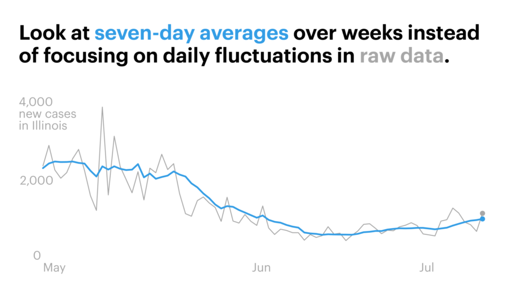
To make sure you don’t get misled, it’s better to look at what’s called the rolling seven-day average, which takes each day’s number and averages it with the six days before it. Many trackers provide this figure to smooth out the data. Also, wait to see if the trend holds. It’s kind of like the stock market; it’s unhelpful to to obsess over daily swings. The experts I interviewed suggested waiting one, two or even three weeks to make sure that any trends you think you’ve spotted bear out.
Let’s look at a specific claim to see how watching and waiting can make a difference in getting the whole story.
Over the past few weeks, President Donald Trump has emphasized that even while coronavirus cases have been rising in the U.S., that’s not a cause for concern because he insists the mortality rate is low. On Sunday, when Fox News host Chris Wallace asked him to address the fact that the U.S. had reached 900 coronavirus deaths on a single day, Trump responded: “I heard we had the best mortality rate. Number, number one low mortality rate.” This is untrue: the U.S. was about in the middle of the pack of 20 countries analyzed by Johns Hopkins University on July 16.
Setting aside the hyperbole, it is true that the case fatality rate (i.e., the number of deaths divided by the number of confirmed positive cases) has been gradually falling even as the daily case counts have soared.
So what’s going on there? Does this mean that the coronavirus is becoming less deadly?
Let’s look a little closer. We’ve known from early in the pandemic — even from the data coming out of China — that this coronavirus is less deadly to younger people and more deadly to older people. We’ve also come to learn that many people, as many as 40%, infected with the coronavirus do not show any symptoms or have such mild symptoms that it would never have occurred to them that they could have COVID-19. So it shouldn’t be a surprise that if we have more testing capacity than early on in the pandemic and are now capturing younger people and more asymptomatic patients, that the case fatality rate would be lower than if the population that’s being tested is mainly older and sicker. That’s what’s been happening recently. Check out Florida: The median age of residents testing positive fell into the 30s in June from the 60s in March.
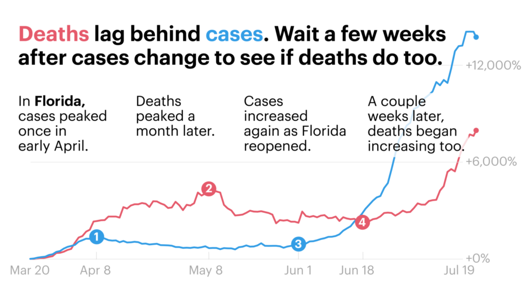
But the other critical thing to remember is that deaths lag behind cases. A patient may get tested once they have symptoms but take a while to get sick enough to need to go to the hospital. With COVID-19, many patients who unfortunately don’t survive are often in the ICU for many weeks before they die. Then there may be a few more days’ delay before the death certificate is recorded.
The delay between cases rising and deaths can be hard to see at a national level, because many states have different story arcs going on: Right now, New York is coming down from its big outbreak, while Texas’ big surge is still on the upswing. That muddles the national picture. But when we zoom in to one state, you can see the picture more clearly. Let’s take Florida as an example.
There are other factors at play to consider as well when tackling a broad claim like, “Is COVID less deadly now?” such as hospital capacity. Dr. Michael Peters, an associate professor of medicine and pulmonologist at the University of California, San Francisco, has treated patients both in San Francisco and in New York City. He flew to New York and worked at a hospital in Queens to help support the overwhelmed doctors during the peak of the city’s outbreak.
“It’s obviously the same disease, but we haven’t ever been overloaded at UCSF. There’s data that shows, and my personal experience suggests, that when systems are overloaded, patients do worse,” he said. “If you take the same 50-year-old man and put him in San Francisco in March versus New York in March, he’d do differently — it’s just that the capacity to take care of people was limited and impaired.”
Peters explained that a lot of this has to do with the hands-on nature of care needed for the sickest of patients in ICUs. “Ventilators need to be watched and monitored to make sure you’re not getting too much air or too little air, because if you have too much air, that can cause injury to your lungs, so the doctors and nurses are constantly evaluating you.”
With each passing month, researchers are learning more about how to best treat the sickest patients. While there still is no cure, there is now some evidence for how to use treatments such as remdesivir and dexamethasone, said Dr. Abraar Karan, an internal medicine doctor at Brigham and Women’s Hospital in Boston, so arguably, your chances of survival are better now than in February. “The longer you wait to be infected, the less chance you have of being part of an experiment, and the better chance you have to be receiving the outcome of a well-done experiment,” he said.
None of this means that the virus itself has become less deadly, noted Boston University’s Fox, so one has to be careful not to leap to the conclusion that just because the case fatality rate has been falling, that means that it’s safe for the elderly to mingle in crowds again.
There Are Some Things We Can’t Know for Certain
Another question that’s been on my mind is whether a layperson can see the effects of specific events on transmission. For example, have protests in my state driven an increase in COVID-19 cases or not?
I’ve already seen people on my social media feeds ardently declaring that protests either did or did not lead to more cases, and therefore this means that masks either do or do not work. Mayor Eric Garcetti of Los Angeles first said there was no “conclusive evidence” that the protests led to a rise in coronavirus cases, then a few days later he said that the county’s director of public health did think that some spread was due to the protesting without adequate physical distancing or wearing a mask. I wanted to know if it’s possible to definitively make these conclusions.
The epidemiologists I interviewed prescribed caution, for a number of reasons.
First, it’s hard to isolate an event in a vacuum. “It’s not like there were protests and nothing else happened — they happened shortly after states started reopening, and just after Memorial Day,” Fox said. How would you untangle if an increase in cases was due to reopening activities or protests, if you didn’t know the identities of people who got sick in ensuing weeks and the history of their movements? Contact tracing case studies might be able to answer these questions, but for a layperson, this would be impossible to discern by just looking at case counts and a timeline.
Furthermore, many states have had testing backlogs, meaning that the cases being reported today belong to people who were swabbed more than a week ago and who got infected even before that. “Are we even seeing it in the numbers yet? That could be contested,” Majumder said. “That’s a piece of this that has been very frustrating. For any analysis to be done, you’d need to know not the national backlog in testing, but what is the backlog for your locality.”
Majumder and her team of researchers are now trying to analyze whether protests in which people were doused with tear gas and pepper spray led to more transmission than protests in which such tactics weren’t deployed. That analysis is even more complicated and best left to the professionals.
When testing any hypothesis, Gu encouraged cultivating a neutral perspective. “Watch out for selection bias, which is when you gravitate towards data that matches your belief and you ignore data that goes against your belief,” he said.
Fox similarly cautioned to be on the watch for “extraordinary claims.”
“If you’re reading a blog post that sounds very scientific and credible, but everything lines up perfectly, then something’s wrong,” he said. “The world doesn’t work that way. The world never fits a perfect pattern. You should expect things to diverge.”
Take a Deep Breath and Try to Look at the Big Picture
I’ve noticed that some folks like to nitpick about specific numbers, with an argument along the lines of, “Well, here’s a problem with this statistic, and that’s why you can’t trust any of these numbers and this is all a vast conspiracy!”
For instance, more than one person has suggested to me that people who have tested positive may be getting retested multiple times, and thus are getting double- or even triple-counted, vastly inflating the number of coronavirus cases. There have also been multiple debates about death counts, with people proffering arguments for why they are either overcounted or undercounted.
To address the concern about double-counting coronavirus cases, I checked with some public health officials, who said that should not be happening, because health departments receive patients’ details, such as names and contact information (which is used for contact tracing work), and they do their best to weed out duplicates when reporting numbers.
“In some cases, could it happen? Sure, particularly if the data doesn’t get entered correctly and they misspell the name or reverse the first or last name,” said Dr. Rex Archer, director of the Kansas City Health Department. “But is it a huge percentage? No. It’s nowhere near the number of people who are positive and untested.”
The thing is, you can always make arguments for why the data isn’t perfect. But that doesn’t automatically mean that the numbers can’t be trusted. This is why I like to step back, wait and see how the trends are going and look for confirmation — then I don’t let myself get distracted by the people in my inbox arguing that a few cases of double counting mean all the numbers are fraudulent.
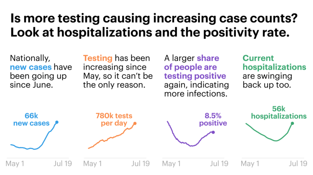
Taking this big picture approach can help us get above the fog of confusion when politicians come along and declare things like “cases are only going up because we’re testing more.”
ProPublica has dedicated a whole post to breaking down that claim in detail, but let me briefly tackle that once more, because it keeps coming back and I think it’s worth addressing one more time.
If the virus was not spreading and, say, you tested twice as many people, then you shouldn’t find double the number of cases. In fact, if the virus was well under control and you tested twice as many people, you should find far less than double the number of cases, and the positivity rate should decrease over time.
But that is not what has happened. From the second week of June to the first full week of July, while the average number of tests per day went up by 41%, the average number of positive cases per day nearly tripled, and the average positivity rate went from 4.4% to 8.5% according to The Covid Tracking Project. That’s a clear sign that it’s not just testing that’s behind the increase in cases. At the same time, in many states where cases are soaring, hospitalizations have also surged, adding further confirmation that we’re not getting the wrong signal.
Find Trusted Sources
If you’ve been finding all the numbers and charts dizzying, that’s very understandable. It’s not really fair to ask people to research and fact check every single thing that they’re told (unless you’re a reporter like me, and that’s your job!).
“I don’t think we need to all know everything,” Majumder pointed out to me, after I asked her for tips for the public on how to read coronavirus statistics. “As a society, we should be able to rely on trusted sources to help us make better decisions.”
But how do you figure out who’s a trusted source? I liked the following advice from Andy Slavitt, former head of the Centers for Medicare and Medicaid Services during the Obama administration, which he shared on Twitter recently. He said to look for people who say “we don’t know” a lot, who give the source for their data and the type of study and who acknowledge their biases and experience.
“Even then they will be wrong on occasion & to keep your trust they should acknowledge it,” he added.
What the Numbers Show Us Today
One last thought: Let’s be clear about what the numbers reveal to us about the state of America today.
Even if the data is imperfect, when you zoom out enough, you can see the following trends pretty clearly. Since the middle of June, daily cases and hospitalizations have been rising in tandem. Since the beginning of July, daily deaths have also stopped falling (remember, they lag cases) and reversed course.
I fear that our eyes have glazed over with so many numbers being thrown around, that we’ve forgotten this: Every day, hundreds of Americans are dying from COVID-19. Some days, the number of recorded deaths has reached more than 1,000. Yes, the number recorded every day is not absolutely precise — that’s impossible — but the order of magnitude can’t be lost on us. It’s hundreds a day.
And there are nowtens of thousands of new infections every day. The last time fewer than 10,000 new cases were recorded on a single day was in March. The recorded number is now above 50,000 a day. This past week, it crossed 70,000 on Thursday and Friday.
The positivity rate nationwide fell steadily for months, as more testing became available. It went under 5% briefly in late May and early June, and it has since climbed back up into the high single digits. In many states, it’s now in the double digits. That means we are not testing enough, and in many states, we are blind to the true extent of who is sick and where the cases are.
The bottom line: We don’t have the pandemic under control. My hope is that this country’s leaders stop squabbling over specific numbers and using partial trends to tell their own narratives. Instead, let’s focus on the takeaway — there’s a lot of work to do.
